Lark Distillery
01 | Client
LARK Distillery, based in Tasmania, is renowned for its premium, award-winning single malt whiskies. The brand is defined by its commitment to craftsmanship, with limited-edition releases and flavour profiles inspired by Tasmania’s pristine wilderness.
Role
-
The design was shaped to capture the raw, untamed spirit of Tasmania, following a discovery workshop to define the creative brief. A layered visual system was developed to create a sense of depth, evoking the richness of the wilderness. Motion was introduced at key moments in the user journey to encourage exploration and make the landing page feel immersive and dynamic.
The product range was carefully presented to ensure clarity, while the overall experience was crafted to captivate Lark’s loyal customers and celebrate the release of the special Wilderness Collection.
| Results
1 week after campaign launch
$62K in sales—one week post-launch.
2.9% conversion rate


02 | Objective
The task was to design landing pages for the Wilderness Collection, an entirely new concept and product launch. The goal was to go beyond showcasing bottles and create an immersive digital experience that captured the wild, sensory spirit behind the collection. Through storytelling and layered design, the experience needed to communicate the character of each single cask whisky in a way that would resonate with both returning customers and new audiences.

03 | Challenge
The challenge was in balancing immersion with clarity. The design needed to carry narrative weight and reflect the brand’s deep connection to nature, while still feeling familiar and easy to navigate. There was a risk of the story overwhelming the interface, so care was taken to keep the experience functional and conversion friendly.

04 | Solution
The approach was grounded in storytelling and a strong sense of place. Inspired by Tasmania’s wilderness, layered visuals and subtle motion were used to build atmosphere without distracting from the product. The Doherty Threshold helped guide decisions around motion and pacing, keeping engagement intuitive and fluid. Jakob’s Law informed navigation, ensuring users felt grounded even within a rich, narrative led experience. Soft transitions and animated landscapes reinforced hierarchy and helped ease users from exploration through to purchase, delivering a journey that felt immersive, elegant, and cohesive from start to finish.
Features
•
Features •
-
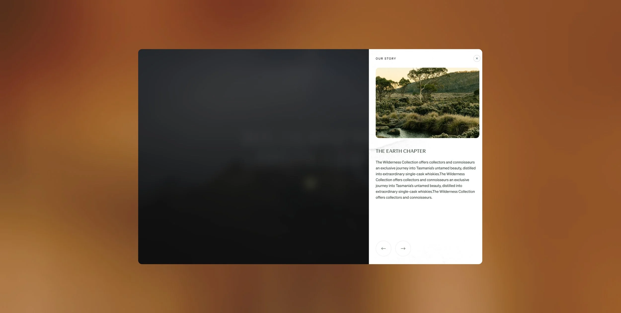
![Digital interface with a story section titled 'The Earth Chapter', featuring a landscape photo of trees, grass, and a stream in the wilderness, with navigation arrows at the bottom.]()
Modals
Modals were used during the exploration phase to let users dive deeper into content without being redirected to a new page, keeping them closer to the end goal while still providing the context needed to make informed decisions.
-
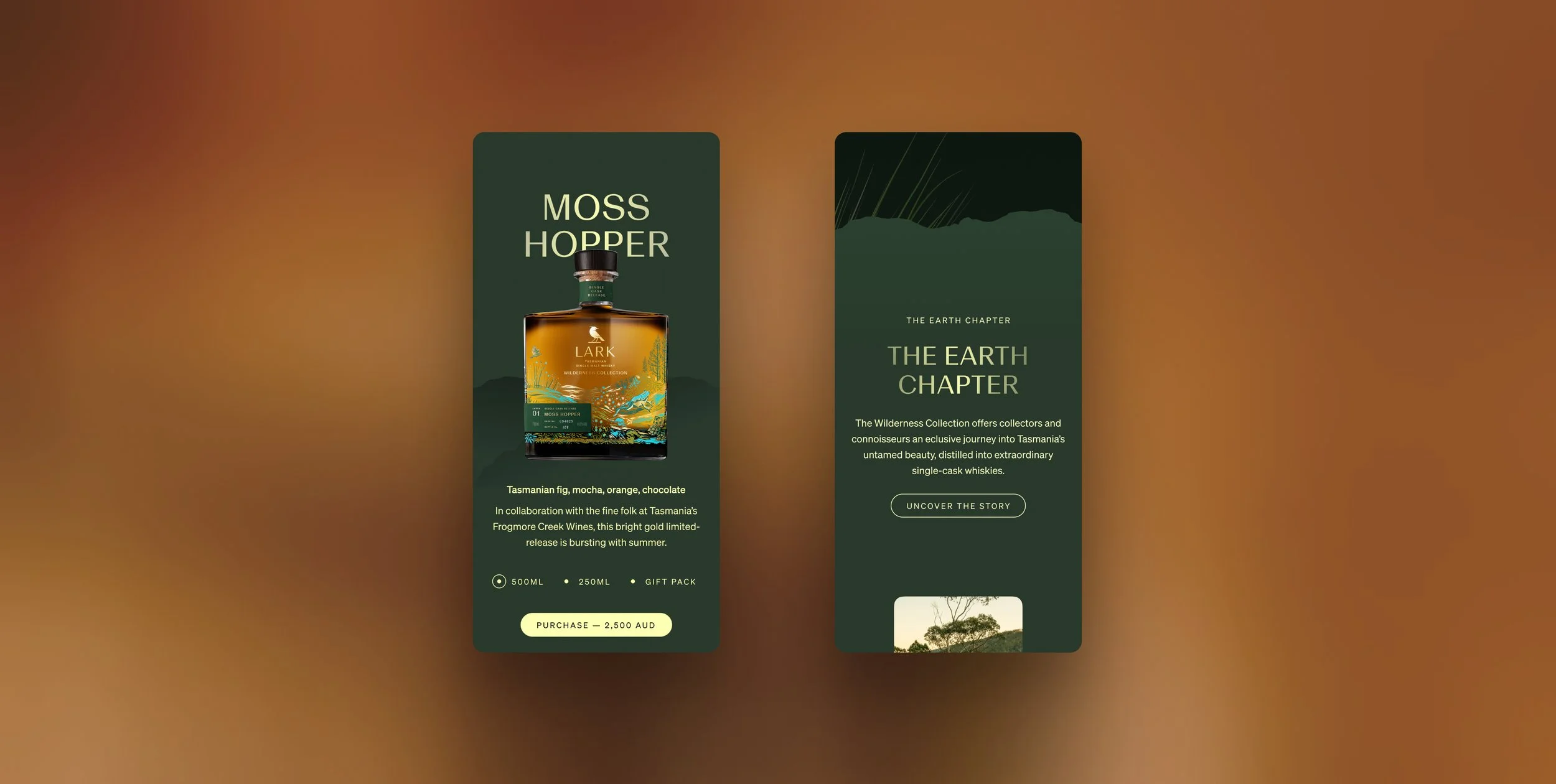
![Advertisement for Moss Hopper whisky featuring a bottle with a landscape illustration, and text describing its flavors and collection. The background is green with mountain and forest imagery.]()
Landscape Layering
The story behind the Wilderness Collection drew inspiration from the rich, layered nature of the Tasmanian wilderness. This was brought to life through subtle animations, textured visual layers, and integrated audio, creating a deeply immersive, sensory experience.
More Projects
-
![An image of the Cultural Center.]()
iSTRAP
-
![An image of the Cultural Center.]()
Ikkari
-
![An image of the Cultural Center.]()
Lark Distillery
-
![Screenshot of a website advertising Bored Cow animal-free dairy milk, featuring three flavored cartons on a purple background with playful cartoon illustrations.]()
Bored Cow
-
![Homepage of an online pet food store featuring a Dalmatian dog and a kitten with categories for dog, cat, puppy, and kitten food.]()
Paw Pantry
-
![A man wearing workout gear stands with arms akimbo against a dark background. The text above reads "WORN BY PROS," and there is a display of fitness products with prices, including a singlet, training belt, wrist wraps, and knee sleeves on the left side.]()
City Strength