City Strength
01 | Client
City Strength is dedicated to redefining what strength training can be. With a carefully curated range of high-quality equipment, the brand combines performance and durability to support every fitness journey. Each product is thoughtfully designed to empower individuals to push their limits.
My Role
-
The discovery workshop revealed that while City Strength held a strong reputation within the strength sports community, the brand faced growing challenges in improving accessibility for new users, simplifying product selection, and communicating key product differences. Sizing confusion, limited educational pathways for first-time customers, and navigation inefficiencies, particularly on mobile, created friction across the buying journey. Although loyalty among competitive powerlifters remained strong, onboarding newer audiences and showcasing the brand’s inclusivity and expertise were identified as critical areas to address to support future growth.
-
Throughout the wireframing process, product filtering and exploration were prioritised within the user flow, ensuring that products and their use cases were presented clearly to highlight real-world application and customer success. This approach was designed to reinforce social proof and build user confidence during the shopping experience. A conscious effort was also made to ensure balanced gender representation across the design to create a more inclusive and welcoming environment. Additionally, motion and interaction were considered early in the design process, with the aim of capturing the energy and dynamism of the gym environment through animation and interactive features.
-
Oversaw QA, browser testing, and the development of acceptance criteria to ensure functionality and alignment with project requirements.

02 | Objective
City Strength's website failed to capture the brand's dynamic spirit. The outdated design, clunky navigation, and lack of product storytelling created a disconnect, leaving users without a true sense of the brand's identity or community. The site missed the mark on showcasing the innovation and strength that define City Strength.
03| Approach
The approach was to craft a website that elevates City Strength’s brand by showcasing products with clarity and flair. Wayfinding was optimised for rapid product discovery, dynamic motion was integrated to modernise the visual presence, and a vibrant community feel was created to ensure the site stands out in the fitness industry.


04 | Solution
We highlighted City Strength’s product features through compelling storytelling and immersive visuals, spotlighting both the athletes and their gear to create context and connection. By combining a strong visual identity with dynamic motion, we captured the quality and impact of City Strength, captivating users and bringing the brand’s story to life.
Features
•
Features •
-
![Online store webpage featuring Nike Romaleos 4 explosive athletic shoes with a large background photo of a person in football gear, and a smaller inset image of the shoes, price $189.95.]()
Featured Callouts
Animated text was used to highlight the key benefits of featured products, bringing them to life in a visually engaging way. This approach kept users actively engaged while delivering product information in digestible bursts
-
![Online store product page featuring a black sleeveless athletic shirt with red accents for men, labeled 'SBD FORGE RANGE POWERLIFTING SINGLETS - MEN - ORANGE,' priced at $159.95, with an 'Add to Cart' button.]()
Intentional Product Pairings
Instead of offering products that aren’t suited to the users needs or related to the product being viewed we used product meta-fields to create tailored recommendations to increase average order value.

More Projects
-
![An image of the Cultural Center.]()
iSTRAP
-
![An image of the Cultural Center.]()
Ikkari
-
![An image of the Cultural Center.]()
Lark Distillery
-
![A website homepage for Bored Cow showcasing animal-free dairy milk in vanilla, chocolate, and strawberry flavors with cartoon cow and space illustrations, purple background, and navigation menu.]()
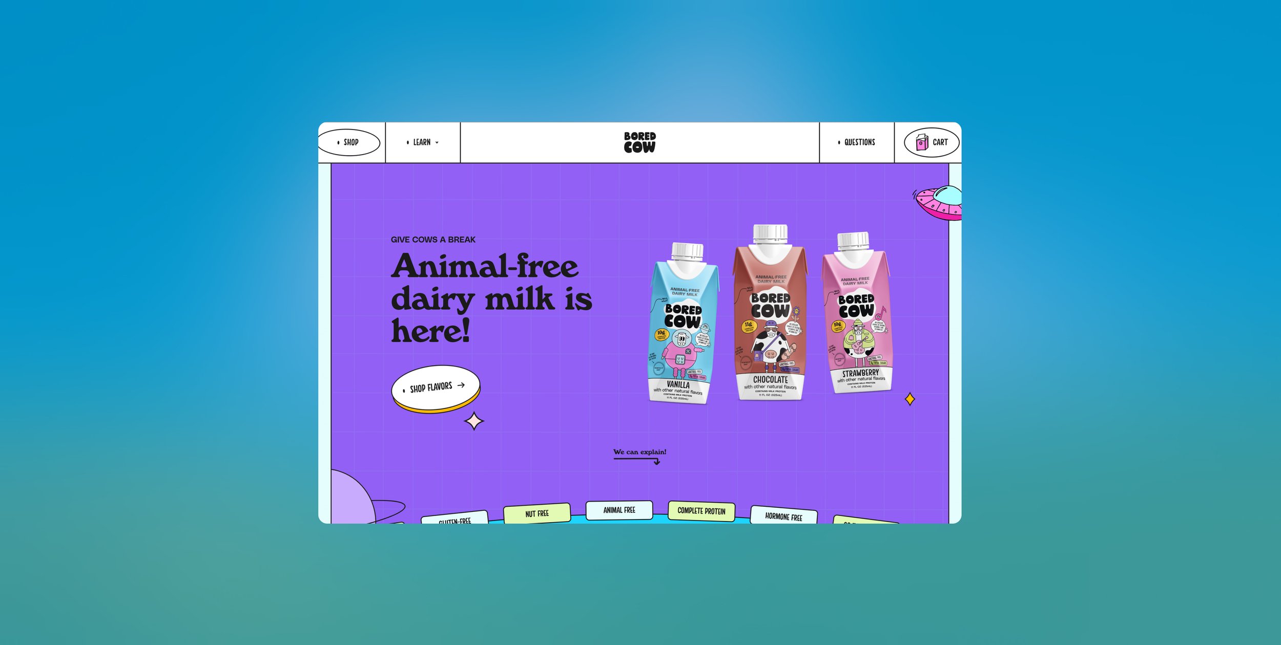
Bored Cow
-
![Screenshot of an online pet food store homepage with a green background, displaying a Dalmatian dog, a kitten, and options for dog, cat, puppy, and kitten products.]()
Paw Pantry
-
![A man modeling workout gear with the text 'Worn by Pros' at the top. The image shows various fitness products, including a tank top, training belt, wrist wraps, and knee sleeves, on the left side.]()
City Strength