iStrap
01 | Client
iSTRAP is an Australian accessories brand specialising in premium Apple Watch bands and accessories. With a focus on quality, versatility, and personal style, iSTRAP empowers users to customise their tech to suit any look, occasion, or lifestyle, blending everyday functionality with elevated design.
Role
-
During discovery, we found that iSTRAP’s strength lies in superior customer service, strong brand awareness, and a better website experience compared to competitors. However, challenges remain with overcrowded navigation, inconsistent brand voice, and perceptions of being similar to lower-quality competitors. Key customer groups include everyday workers, sporty users, fashion-driven buyers, and creatives, all valuing durability, style, and ease. Pain points centre around difficulty finding the right product and a lack of clear, lifestyle-driven content. Opportunities exist to streamline the site experience, showcase quality visually, strengthen brand personality, and nurture customer loyalty.
-
During discovery, we found that while iSTRAP led competitors in customer service, brand awareness, and site experience, challenges remained around overwhelming navigation, inconsistent brand voice, and weak product differentiation. Customers valued durability, style, and functionality but often struggled to find the right product easily. From this, we focused on improving product exploration, simplifying wayfinding, and elevating the perception of premium quality across the site. A key solution, a product strap finder tool, was concepted to streamline selection but did not proceed to launch due to feasibility constraints. These insights shaped a clear opportunity to refine navigation, visually demonstrate quality, and strengthen brand trust.
-
The design phase focused on creating a more engaging and intuitive experience by thoughtfully integrating motion across every page. Subtle interactions, like a blinking dot on call-to-actions, were introduced to guide users, appearing only when an action was shoppable or linked to the cart, to create clearer pathways without overwhelming the experience. Drawing inspiration from Apple’s design system, familiar UI patterns were adopted to build a cohesive and intuitive environment for Apple users while still reflecting iSTRAP’s expressive and energetic brand. Product lifestyle imagery played a central role, with products consistently featured to keep users just a click away from adding to cart or viewing details, merging premium inspiration with a distinct iSTRAP identity.

02 | Objective
The objective was to design a site that reflected the level of detail, craftsmanship, and variety ISTRAP offers its customers. While the previous website displayed the product range, it fell short in communicating the premium quality and refined experience behind the brand.
03 | Challenge
The challenge was to design a site that aligned with the expectations of Apple users, who are highly attuned to polished, intuitive experiences. The visual language needed to mirror Apple’s iOS design standards while still feeling distinct to ISTRAP, conveying both quality and trust to position the brand as the go-to destination for premium Apple Watch accessories.


04/04 | Solution
A highly refined, sleek user interface was designed to meet the expectations of Apple users, positioning ISTRAP as the go-to destination for Apple Watch bands. The experience highlighted the brand’s extensive range of colours and styles, giving users the freedom to express their individuality. Animation was used strategically to boost engagement and draw attention to key interactions, particularly around calls to action like ‘Add to Cart’ or moments where added context was needed. A subtle flashing dot was introduced to elevate the prominence of these CTAs and act as a visual guide, helping users navigate to essential areas of the site.
Key Features
•
Key Features •
-
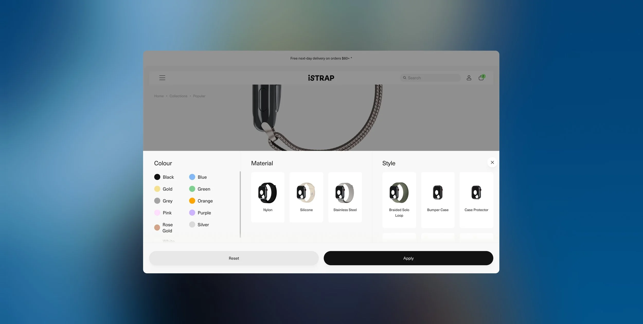
![Online customization menu for a wearable device, showing options for color, material, and style.]()
Visual Filtering System
Implemented a visual filtering system that allowed users to easily compare and distinguish between product variations, making selection more intuitive and reducing friction in the decision-making process
-
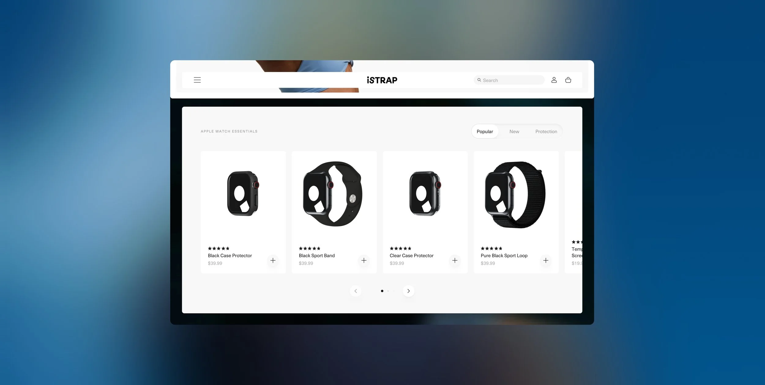
![Computer screen displaying an online store for Apple Watch accessories, showcasing various protective cases and bands.]()
Collection Tabs
Optimised the previous collection section by integrating tabbed navigation within the featured collections block, enabling more products to be showcased in the same space and broadening appeal across different customer preferences.
-
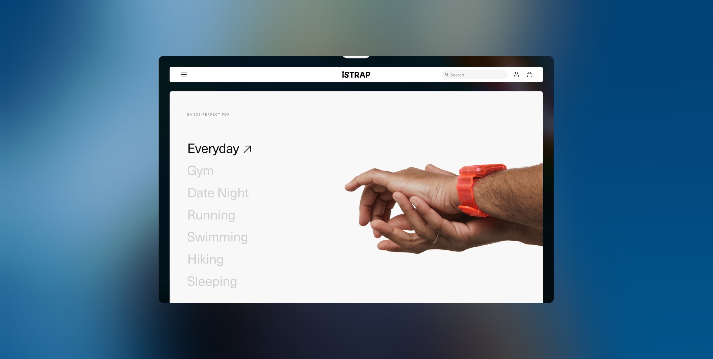
![A computer screen displaying a list of activity options including 'Everyday', 'Gym', 'Date Night', 'Running', 'Swimming', 'Hiking', and 'Sleeping'. A person's hand wearing an orange watch is reaching out towards the screen.]()
Use Case Collections
Created “Perfect For” collections to align product styles with specific moods, settings, events, or occasions, helping guide users through curated selections tailored to their individual needs and use cases.
More Projects
-
![An image of the Cultural Center.]()
iSTRAP
-
![An image of the Cultural Center.]()
Ikkari
-
![An image of the Cultural Center.]()
Lark Distillery
-
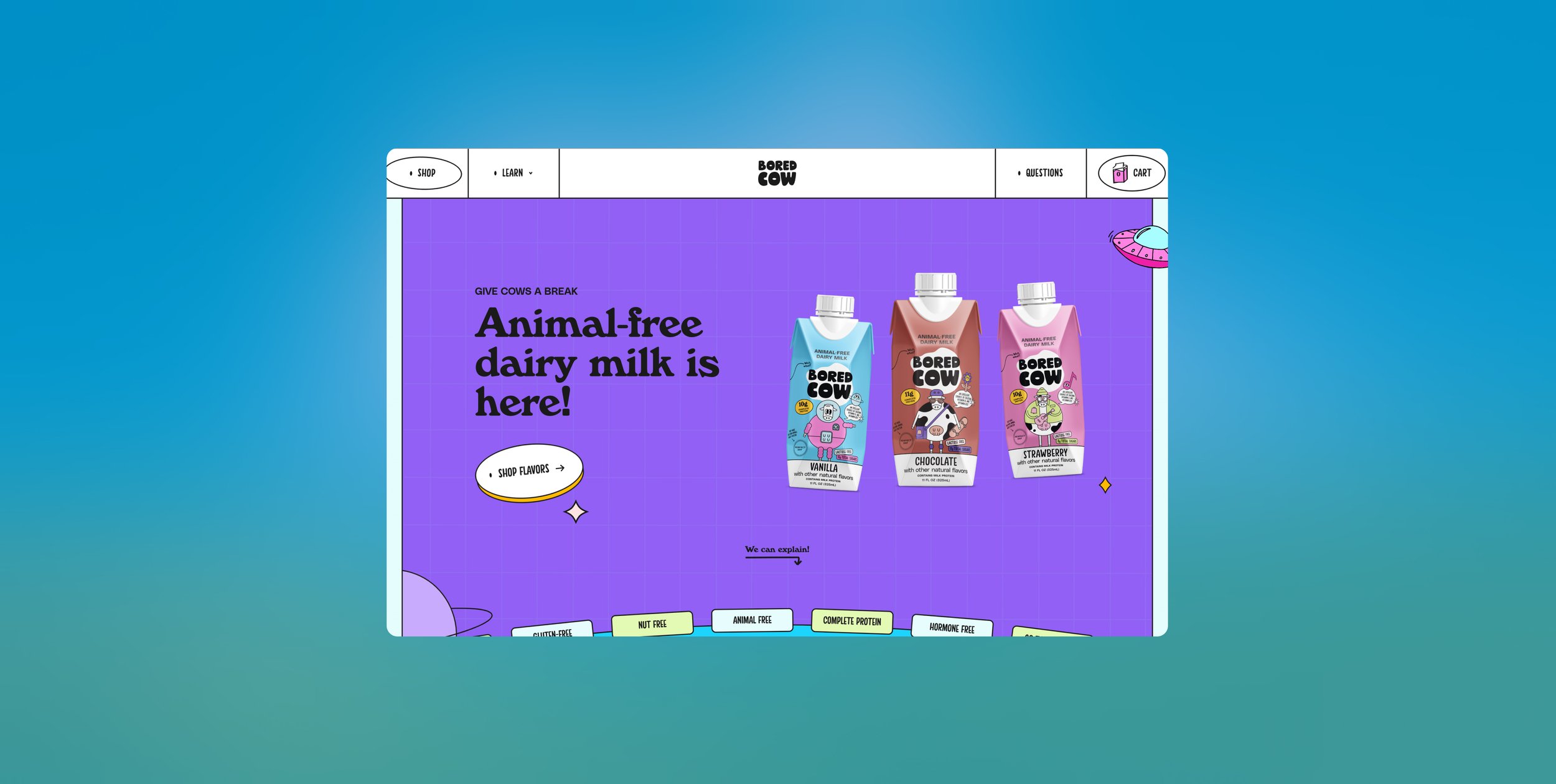
![Online webpage for Bored Cow featuring animal-free dairy milk in vanilla, chocolate, and strawberry flavors on a purple background.]()
Bored Cow
-
![Screenshot of a pet food e-commerce website homepage with a Dalmatian dog and a kitten, featuring categories for dog, cat, puppy, and kitten food.]()
Paw Pantry
-
![A fitness model showcases workout gear and accessories on a black background with the text 'WORN BY PROS'.]()
City Strength